
Prototyping
"The problem with prototypes is they don't always work." - Laurie Anderson
Over the course of 10 weeks, our team prototyped both existing and new methods to create an equitable design process. Based on the 6 tenets of Critical Race Theory, the team began exploring ways to embed each tenet into the design process.
Multiple Overlapping Identities
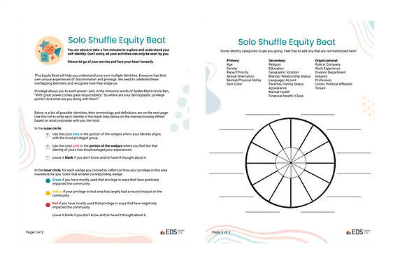
For the first iteration, we took an existing intersectionality wheel prototype and tried to incorporate it into an activity to guide designers map out the intersectionality of their own individual identities.
For the second iteration, we refined the worksheet to have fully fleshed out instructions.


For the final iteration, we adapted it to look like the rest of our branding.
Racism is ordinary
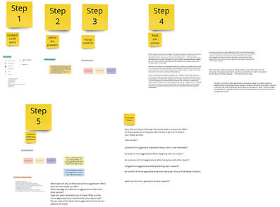
The first iteration came out from a brainstorming session where our focus was to try and redesign an existing Inclusion nudge in a way where it could be used within design teams.
In the next iteration, we tried to break down the activity into individual steps.
.jpg)
.jpg)
For the final iteration, we added instructions on how to establish a safe space and some reflections at the end of the activity deck.

A Celebration of Culture Through Storytelling
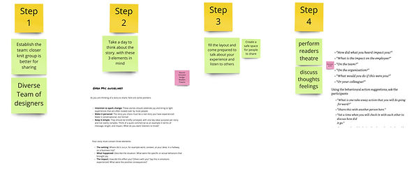
This Equity Beat is based on Inclusion Nudge #9 from “Inclusion Nudges For Motivating Allies” by Tinna C. Nielsen and Lisa Kepinski. The original nudge employed storytelling to generate empathy around moments of exclusion. We broke down the activity into clear, well-defined steps so that the participants could understand the goal and intention of it better.

.jpg)
For this iteration, instead of focusing on exclusion, Open Mic is about moments of joy experienced by underrepresented communities. The core of the inclusion nudge was left unchanged and translated into a slide deck to make the material easily accessible.

Liberalism itself can hinder anti-racist progress
We took an existing well established and certified racial colorblindness survey and tested it out with external participants.
Based on their feedback, we redesigned it to improve the accessibility and interactiveness of it.

.jpg)
.jpg)

The final iteration is created with SurveySparrow and connects back to this website.
Those with power rarely concede it without interest convergence / Race and racism are socially constructed
The Encore beat originated from the concept of interest convergence, the idea that those in power only support the interests of underrepresented communities when they share those interests. The first iteration used a Venn diagram to help designers visualize the overlap and disparity between their design and their users’ interests.
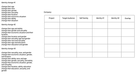
The second iteration was designed to allow for easier comparison between multiple user identities. This revealed the need to guide designers in discovering diverse identities.
.jpg)
.jpg)
The third iteration provided a guiding structure with prompts to help designers imagine diverse identities using their products.
The fourth iteration aimed to combine the chart organization of the second iteration with the guiding prompts of the third. This created a checklist feeling and revealed the need to prioritize deeper engagement with the identities designers generated through the beat.


Emerging from co-creation sessions with design professionals, iteration five divided the beat into two parts. Part A focused on inspiring designers to think critically about the diverse users that could interact with their designs. Part B encouraged designers to involve diverse identities in their design process and think beyond just their user needs.


Iterations of the website
When the teams started the journey of creating a website, we chose to use Squarespace as it enables teams to collaborate simultaneously and create things in square grids.
We quickly realized that in order to show the innovation of our concept, we knew we needed more interactions, animations, and more customizability in general. We switched to Figma to brainstorm how we can elevate our final product.


What you see right now is the third iteration of our project, with so many more to come.
